


Exploring the OPS (Priority) Analysis Dashboard
In 2019, Advantage Group International introduced a business intelligence (BI) tool to improve the overall utility and insights capabilities of Advantage ReportTM. A significant revolution in our traditional report delivery, this new digital tool has transformed the experience that users of Advantage Report have been long familiar with.
Via a series of blog posts, we will provide you with tips and tricks useful for navigating the dashboards within Advantage Analytics with greater ease and agility. In this blog post, we share how to answer your most critical business questions using the OPS Analysis Dashboard.
Overall Performance Significance (OPS) measures what Practices are most important to retail accounts. The OPS Analysis Dashboard displays how you performed across the Top 10 most important practices. The OPS score is measured on a scale of 0-100.
The business questions you’re seeking answers to:
- How am I performing across the Industry’s Top 10 Priorities?
- What are the Top 10 Priorities by retail account and how am I performing against those things that are important to them?
Gain insight by following these simple steps:
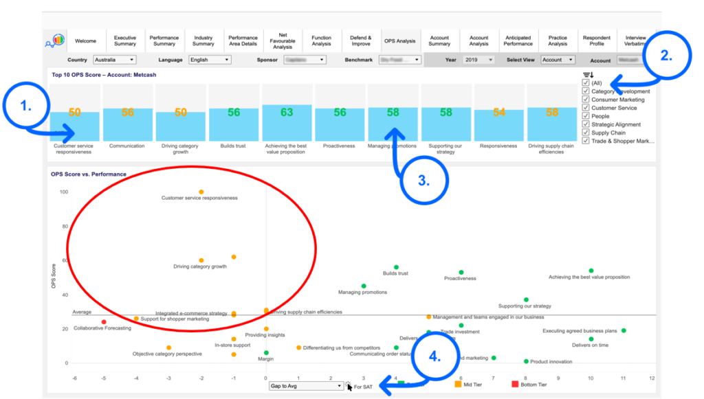
A. Top 10 Priorities – All Retail Accounts
The default landing screen for this dashboard displays the top 10 Priority Performance Areas across the Industry (all retail accounts) [1]. The default is also all factors/all Performance Areas, however, you can drill down to the importance of each Performance Area by using the tick-box feature in the top right of the screen [2].
Across the top of this tab, you can see your Net Favourable score for each Priority Practice. By hovering the cursor over each bar, you can bring up the retail OPS score by Practice [3].
In the lower scatter chart on this dashboard, you can see the OPS score (0-100) on the X-axis and the NF score on the Y-axis. Hover your cursor over any of these coloured dots to reveal the retail OPS score, your Rank and Gap to Average NF.
Review which Practices are rated by retailers as above average importance, where you are scoring well and those areas that are an opportunity for improvement (red circled quadrant). Use the drop-down menu at the bottom of the page to toggle between NF Gap to Average and NF gap to number 1 (4).
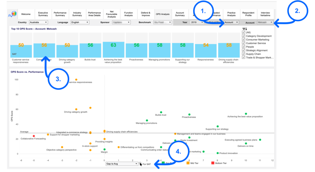
B. Top 10 Priorities by Retail Account
Go to the select view drop-down menu in the Top Right of the screen and select Account [1].
Go to account drop-down to select the retail account you wish to view [2].
For that retail account, we can see in the bar chart across the top which practices are important and your Satisfaction (SAT) scores measured against these [3].
The scatter chart across the bottom of the dashboard shows which practices are rated by that retailer only as of above average importance, where you are scoring well and those areas that are an opportunity for improvement. Use the drop-down menu at the bottom of the page to toggle between SAT Gap to the Average and SAT gap to number 1 [4]. Hover your cursor over each practice dot to discover your rank for this practice at that retail account.
Reminder: You can always download and export your dashboard views from Advantage Analytics by using the Download function in the top right corner of your screen.
For Additional Technical Support or Troubleshooting, you may contact Gillian Silvestre directly at gsilvestre@advantagegroup.com or 02 8282 0033.
See Next Related Post: Using the Performance Area Summary Dashboard