


Today marks the launch of a new logo for Advantage ReportTM. While this change is subtle, it is rooted in strength, encapsulating the enhancements that make the experience of Advantage Report in 2022 so great. As we excitedly prepare to launch this year’s improved program built on a new research framework, a digital-first experience and a newfound alignment between supplier and retailer partners, it’s only fitting that our logo improves to follow suit.
Why We Decided to Evolve
At Advantage, we thrive on change. It’s inevitable, a constant, and something to be celebrated. In 2017, we debuted the Advantage Report logo you’ll find on reports and presentations today. Alongside this, we attached the names Supplier and Retailer to distinguish the premier reports within our syndicated portfolio. And while these names were satisfactory, they weren’t intuitive or memorable. We knew we could do better, if not for us, then of course for our clients.
No Longer Main and Mirror
Preceding Advantage Report Supplier and Advantage Report Retailer, Main and Mirror report names were widely adopted. But this isn’t who we are anymore. The foundation for our product’s evolution is rooted in bringing suppliers and retailers closer together, having a dialogue on an equal playing field. As such, we won’t acknowledge one partner having the upper hand while their counterpart is their proverbial “mirror.”
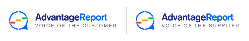
Both partners are equal in our eyes and what ties them together is the value they place on listening to one another in order to improve. Therefore, to replace these dated Main and Mirror labels (and the Supplier and Retailer report names that we never got quite right), we introduce Advantage Report Voice of the Customer and Advantage Report Voice of the Supplier.
The Design Thinking Behind this Evolution
Our change mentality is rooted in maintaining the integrity of the parts that work – this is evident in the consistency of our wordmark and colour pallet. The foundation for our change in iconography is the power of our new research framework. A circle has always represented the 360° nature of our engagement solutions. Today’s logo features a circle sliced into quarters to embody the engagement drivers surrounding our signature stoplight colour steps. The caret that extends from the bottom right quarter of the circle forms a speech bubble, the bedrock of our engagement expertise, and a natural tie to our new ‘Voice of’ report names.

What’s Next?
Over the next few months, you’ll see this new Advantage Report identity in action – across our website, within your reporting, and even in your inbox. Your trusted Advantage Advisors will speak to you about Advantage Report Voice of the Customer and Voice of the Supplier with such ease that it feels instinctual. Our objective with this change is to be more consistent, relevant, and recognizable. Let us know what you think of this evolution in our branding.